
I’ve written previously about how, in one of my fantasy hockey leagues, team identities are treated very seriously.
A few years ago, that led to me creating new logos for six of our teams. In our most recent offseason, four teams rebranded in various ways, which led to me creating another new set of identities.
I’ll admit that I’m not completely thrilled with some of these but I am happy that, with these changes, every team in the NSHL now has an original logo.
Cape Breton Eagles
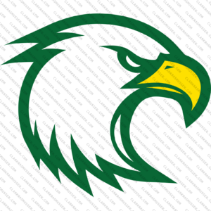
The move that kicked everything off was the retirement of our Cape Breton Capers general manager. With his departure, our Portland Huskies general manager requested to move his team to Cape Breton as the Cape Breton Eagles.
I mentioned when I wrote about the North Dakota Nighthawks that there are a lot of bird-themed logos out there, which makes it hard to do something original. Further complicating things in this case is that there’s a Cape Breton Eagles team in the QMJHL.
For this, I decided that some generic-ness couldn’t be helped and that my primary goal would be to not match the Nighthawks. To do that, I went with a head-only approach to the bird and viewed it at something like a 3/4 angle. The colors tie it to the location, all of them taken from the Cape Breton flag. Using green, yellow, and white, it made sense for the eagle’s head to be white, the beak to be yellow, and the outline/shadow to be green.
In general it’s a generic look but it fits well for the league.
Chicago Stars

With the Huskies having moved to Cape Breton as the Eagles and the Cape Breton Capers identity having been retired, the league needed a new identity to take over for the Capers. Enter the Chicago Stars.
This is an idea that I had been sitting on since 2020 or so, when the NSHL was looking at expansion.
I love minimalist design and the elements of the Chicago flag provide a great opportunity for that. The city’s famous six-pointed stars provide the base with a C in a style reminiscent of the lettering on the Chicago Theatre marquee overlaid on that.
Again, there are originality issues. Between when I first drew this up and when we started using it, the NWSL’s Chicago Red Stars became the Chicago Stars. Additionally, the C+Star idea was also used by the Chicago Cubs for their cap logo in their 2021 City Connect jerseys. But both of those ideas come from the same, obvious, source so it shouldn’t really be a surprise.
San Antonio Law
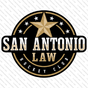
This is another one I’d been sitting on for quite awhile.
A couple seasons ago, our Thunder Bay Kodiaks GM suggested moving his team to San Antonio. We played with the idea of the “San Antonio Law” but I couldn’t pull together a logo that I was particularly happy with. After I cranked out the logo for the Cape Breton Eagles, though, I felt like it wasn’t fair to him to keep sitting on this one so I revisited it and pulled it together.
The original thought was significantly flatter and used a six-pointed star to represent a sheriff’s badge. It was also black and silver to tie into the San Antonio Spurs. With the Chicago Stars going the six-pointed star route, I switched to a five-pointed star for San Antonio. I then added some shading to it and the lettering and switched from silver to gold, which gave more of the Old West look I was going for.
There’s actually a version of this that uses a dark brown instead of black and I think it’s the best version but the NSHL already has the Fort Worth Fighting Squirrels using brown so I decided not to go that route for San Antonio.
Montreal Wolf Pack
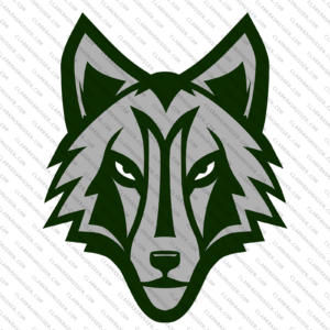
The last of the new set of NSHL logos was the hardest to sort out.
With three teams already making changes, the new general manager of the NSHL’s Ottawa Valley Wolfhounds decided that he wanted his team to become the Montreal Wolf Pack. Like with Eagles, this was a challenge because there are so many wolf-themed logos out there.
I really wanted to do something minimalist here again, like a silhouetted howling wolf or something, but my attempts at that just looked really weak. With the Portland Huskies gone from the league, it opened up the possibility of using a forward-facing wolf head without looking too much like a forward-facing husky head, so I ended up going that route.
Once I decided that, I knew that I wanted to shoehorn a barely-hidden “M” for Montreal into the wolf’s browline. Then it was a matter of determining exactly what the shape of the head would be and how much shadow to use. I originally drew it up in two-toned grey but ended up swapping the darker grey for a dark green. I tried a bunch of different color combinations there and I’m still not thrilled with it.
I think the big takeaway from this set of logos is how I’m not thrilled about any of them. In that first set a few years ago, I drove the changes and set the timeline and was able to give myself room to work. On this set, changes were requested, and I had to work on that timeline. I wouldn’t have used them if I wasn’t okay with them but I wouldn’t call any of them my best work.


