We all know that I love branding. And I’ve written about the experience of developing the brand for So Puzzled Puzzle Company, the jigsaw puzzle company that Jenny and I own.
An event that So Puzzled is participating in later this month gave me an opportunity to develop an alternate brand for the company and it was a lot of fun to work on.
Destination Stars Hollow takes place in Brighton, MI, and features downtown businesses basically cosplaying as businesses from the Gilmore Girls TV show, which takes place in the fictional Stars Hollow, CT. For example, our local indie bookstore 2 Dandelions Bookshop paints their front windows to take on the identity of Stars Hollow Books.
This year the event has expanded to include a vendor area and So Puzzled Puzzle Company will be there. In addition to some other event-exclusive things that we’ll be doing, we decided that we wanted to get in on the cosplay and become Stars Hollow Puzzle Company (which doesn’t actually exist in the show but we have a backstory for it). This gave me the opportunity to come up with a brand for our fictional counterpart.
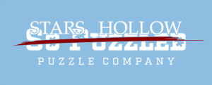
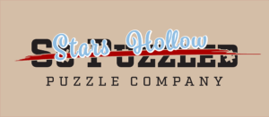
The initial idea was to start with our existing logotype and “scratch out” the “So Puzzled” part of the name, simply replacing it with “Stars Hollow.” On the first pass, we used the font and colors from the show’s “Welcome to Stars Hollow” sign but it wasn’t very legible.
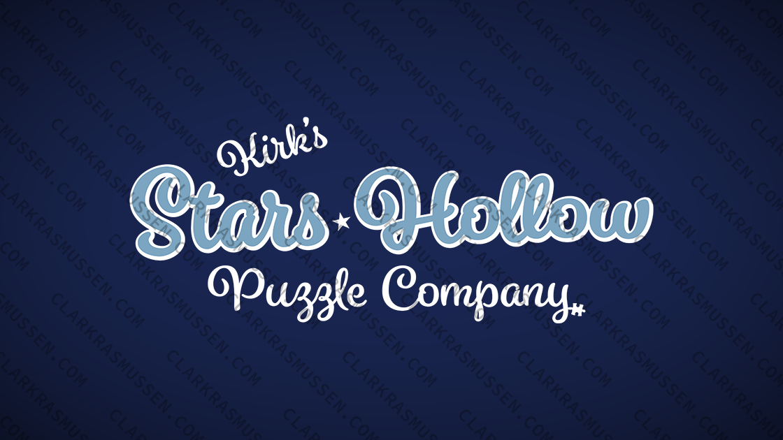
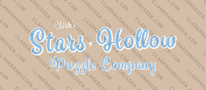
For the second pass, I changed the background to a light brown that is being used in branding for the event, saving the blue from the town sign for use in a script text treatment for “Stars Hollow” and adding an offset white outline (not quite a drop-shadow). There was something there but I was still having trouble with it. In particular, I didn’t like that it relied on the background color being that brown.
We bounced it off of a few friends and, while we got positive feedback, one of them said something that made me re-evaluate. “Oh my goodness, can you put ‘Kirk’s Stars Hollow Puzzle Company?!’ Because Kirk would.”
At which point I realized that we’ll have enough So Puzzled branding in our booth, we don’t need our cosplay logo to include it. As such, we could just create a brand for (Kirk’s) Stars Hollow Puzzle Company,
It still felt like we were relying on that brown background a bit too much and I didn’t love the shape of all of the letters, but it felt close. I decided to re-draw all of it, clean it up, and see how I felt then. And in that process, Jenny suggested darkening the blue for the “Stars Hollow” text, which was the final piece to fall into place.
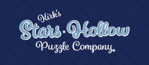
With the darker blue, we can use the brown background or we can use blue or purple or any number of dark colors, making it perfect for use on t-shirts for the event and for some of the accessories around our booth.
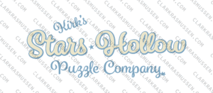
I came back to it a couple days later to do a version on a white background, which I don’t love as much but I think will be helpful.
It was a lot of fun to put this together and I hope attendees of the event enjoy it as much as I have.