My friend Jenny operates as NextJen Mobile, which led to me creating a NextJen logo last fall.
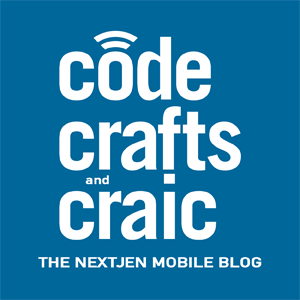
Recently, Jenny decided to pull her development blog – Code, Crafts, and Craic – off of Blogger and onto the NextJen site. I ended up coming up with a type treatment that ties Code, Crafts, and Craic into the NextJen branding.
The important question to answer first was whether Code, Crafts, and Craic was becoming the NextJen blog or whether the NextJen blog was called Code, Crafts, and Craic. It may sound similar but it’s a matter of which brand is more important. Jenny decided that the blog would be keeping it’s name and focus, it was just moving inside the NextJen web property.
With that decided, we knew that the focus was on making the existing name look like NextJen, rather than tacking the existing name onto NextJen.

We started with the “NextJen” type treatment and applied it to the words “code,” “crafts,” and “craic.” The word “and” is dropped in the empty space between “crafts” and “craic” but the commas in the name are left implied by line breaks. The three Cs are aligned to the left but the block of text that forms is centered over the text “The NextJen Mobile Blog.”
The aerials that appear over the tittle of the J in the NextJen logo are repeated over the O in code, modified to fit the O better. The aerials are derivative in both logos but it provides an extra bit of visual continuity tying them together.


